Graphing: Spatial Distributions
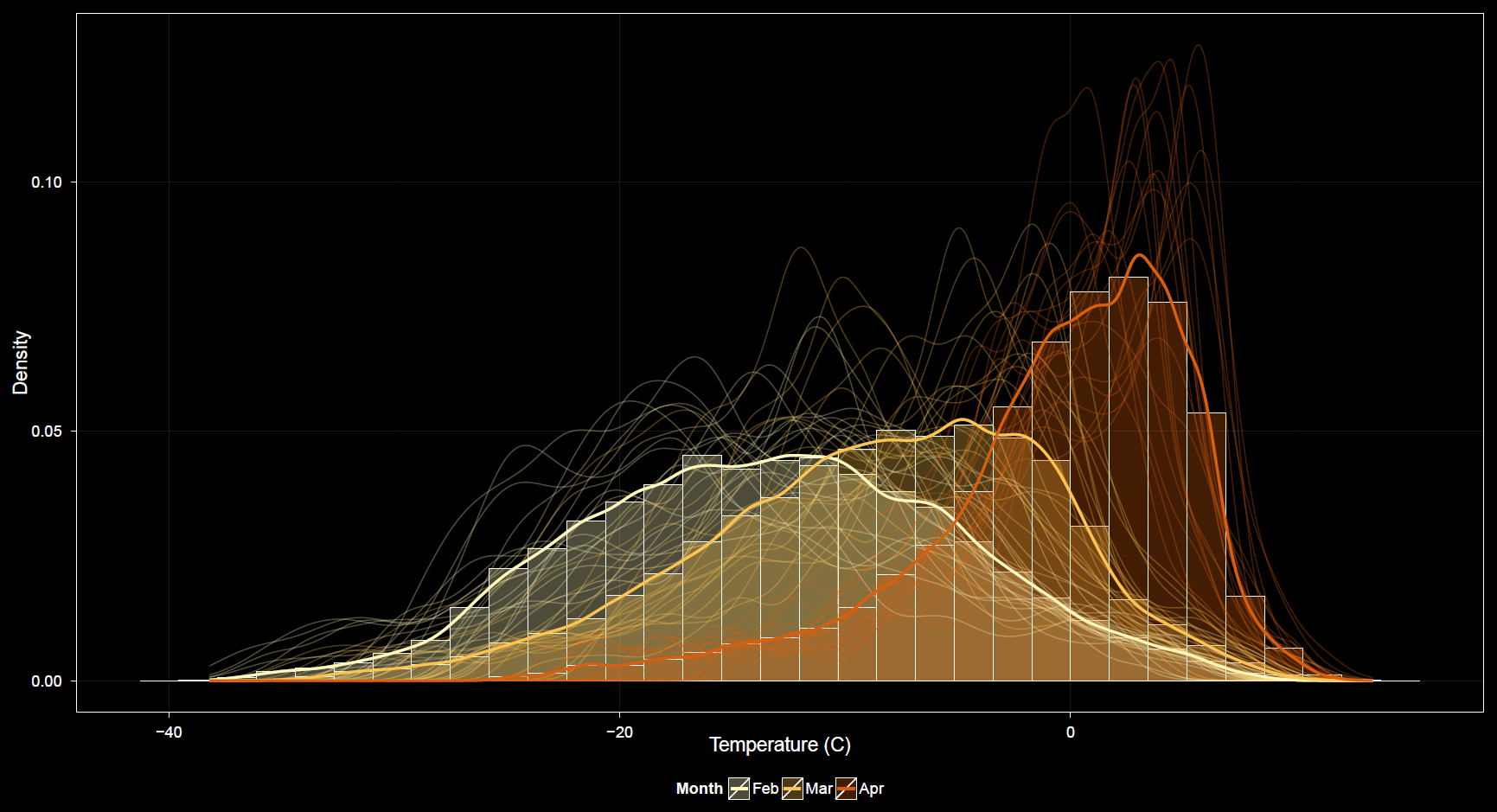
This group of plots is characteristically different from all previous plots which describe spatially aggregated data through time. The distributions plots show how data vary across space by way of histograms, density curves, and stripcharts (using boxplots and/or points). Similar to the variability plots, several options change dynamically based on the subtype of plot selected. The two main categories of plots are histograms/density curves and stripcharts.
Special note
The name of this plot tab will eventually be simplified to Distributions. I have plans for adding more variables to the app beyond the current climate variables, not all of which are spatially explicit in the same sense as the these. Some variables are at a spatially aggregated scale. As such there is not distibution of values across space to graph here. In fact, there are not even statistics such as the mean, standard deviation, or 95th percentile value across space for the other plots in the app previously discussed. These other variables have distributions of course, but they vary along another dimension, namely across simulations.
Specifically, I will be adding fire and vegetation model simulation outputs to the app. Although a variable such as total area burned in a given geographic region does not vary across space like the spatially explicit temperature and precipitation data already contained in the app, it does vary across simulations. Each simulation represents a realization from a random process.
In the case of these variables, specific statistics as well as distributions will be available, identical to those available for the climate variables. The only difference is they will refer to difference across simulation space rather than geographical space directly. However, they still represent spatially explicit processes, but aggregated and overlain in presentation. Though directly comparable in many useful ways, it is still important to note the distinctions between the dimensions over which different variables are distributed.
X-axis
When plotting histograms and/or density curves, the x-axis must be a numeric variable such as temperature or precipitation. The y-axis is the density of course. When plotting stripcharts, the x-axis options are similar to those for other plot types. Numeric data values are once again along the y-axis.
Grouping
This is similar to grouping for other plots.
Faceting
This is similar to faceting for other plots.
Plot type
When a numeric data variable is selected as the x-axis variable, a histogram or density curve are available. When other variables are selected, stripchart is available. When graphing a stripchart, there is an option to overlay points which is not applicable to the histograms or density curves (unless I add a rug plot option later).
Due to the potential number of bootstrapped samples across multiple combinations of factors, it is highly advised to thin the sample for plotting clarity (as well as speed). In fact this is so crucial that I will probably remove the slider bar for this option and require it, forcing a sample thinning to occur automatically inside the plot function invisible to the user. Once this change is made, a percent thinning will be indicated somewhere.
Checkbox Options
Options unique to the variability plots include Similar to the variability plots, boxplots are also available here under certain conditions. This option is available when the plot subtype is a stripchart because of the correspondence of axes and information plotted. It does not make sense when histograms or densities are selected.
Points may be drawn for the stripchart but not for histograms or densities (again, unless I add a rug plot overlay). Lines may be drawn over histograms and densities, but not between strips along a stripchart. Histograms and density curves maintain their standard orientation whereas stripcharts may swap axes to alternate between displaying vertical or horizontal strips. Other options are similar to those found in other plots.