Options Overload 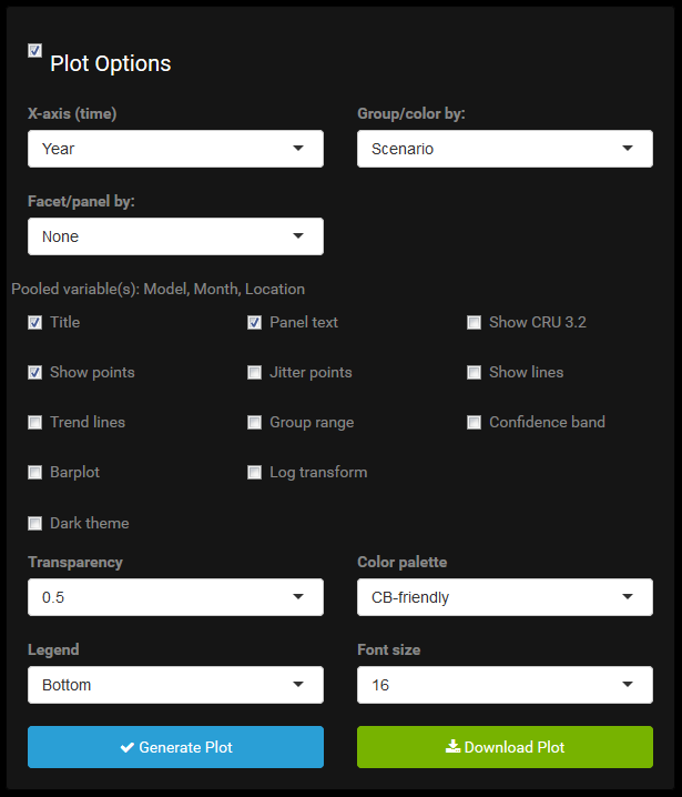
What are all these plot options? And why do they change when moving across the navigation menu or updating the data selections?
Plot Options are Data-Dependent
Plot options depend on the data. This is trivial, but worth pointing out because it’s very easy to plot with a trigger finger and not give much thought to what is being plotted. For instance, in the Time Series plot, the x-axis is always time, and this is a completely independent variable. The options in this menu are always the same, regardless of data selection. Even if the user selects only one month and one year, they can still plot using month, year, or decade as the x-axis variable.
However, the next menu for selecting a grouping variable, is dependent on the data subset. Grouping is for factors and it’s only sensible if there are at least two levels of a factor in the data table. The menu, among others, must be updated when the data changes. Some options are hierarchically dependent. For example, the color options dpened on the grouping variable which, for some plots, depends on the axis variable(s).
Plot Options are Plot-Dependent
Availability of plot options also depend on the type of plot. Some of this is obvious, such as not adding points to a heat map, or contour lines to a univariate time series plot. But others are more subtle. For example, in the time series plot CRU data can be directly overlaid on the selected GCMs by checking the Show CRU 3.2 checkbox. In the heat map there is no way to overlay CRU on top of GCM(s) in the same fashion. The only option is to merge them by properly weighted averaging into one heat map, though realistically you want to facet, not group, by GCM/CRU and see them side by side. The heat map offers a Cell values checkbox which when checked will print the data values in the heat map cells. This is helpful because seeing the numbers on cells of different color gradation can be easier to interpret than continually glancing to a color key that might only be harder to read anyway. On the other hand, printing values on the time series plot would largely be clutter.
Some Things are Just not Allowed
In the time series plot, precipitation may be plotted with points, lines, and/or bars. For temperature, bars are prohibited. Yes, I can force ggplot to generate such a graphic, but it does not make much sense and is bad practice since temperature does not have a real zero (unless we’re working in Kelvins, which we’re not). The app uses bars to plot amounts, not deviations from a mean for instance. As such they don’t work well for temperature. It’s certainly impossible to plot the bars in stacked form or as proportions. The fact that dodged bars can still be forced makes it all the more sinister.
And Some Things are Just a Pain
Drawing lines connecting points along the x-axis when the x-axis is a nominal categorical variable should be prohibited in my opinion. It gives a nonsensical sense of continuity. But also, this could in rare cases be useful. Given that I have bigger fish to fry, this special case has not been excised from the app.
As another example, the CRU data overlay has different implementations throughout the app. There is no uniform approach that works equally well for all plot types. In the time series tab, there is an explicit overlay. This is clear and powerful, but a limitation is CRU data cannot become grouped by a factor when GCMs are given a grouping factor, because after all CRU data clearly cannot be colored the same as the GCM outputs or we couldn’t tell them apart.
Alternatively, in the Variability plot, CRU data are explicitly merged with the GCM subset as a unique “phase/scenario/model” combination (even though really it is none of those things) in order to facilitate it being graphed more seamlessly with the GCM data. This allows it to stand out more clearly when grouping by model, but has the drawback of averaging it in with GCM values when grouping by a different variable rather than a strict, uniquely colored overlay.
When seeing but through a glass darkly, we just need to know the best angle at which to hold the glass to the light. The plots available in the app cannot display absolutely anything the user wants, but certainly in more ways than I like to think about. As a result, there are many ways to look at the same thing, and some are far better than others. This app will allow the user to plot some things that don’t really even make sense to look at or think about. It requires that you think clearly about what you are doing and what you aim to do. With great power comes great responsibility.
Generating and Downloading Graphs
Analogous to generating a data subset, the user can graph in the browser by pressing the Generate Plot button. Also similar, once this occurs, an adjacent Download Plot button will appear. This allows the user to download the plot in PDF format. The downloaded PDF will not be exactly identical in its formatting to that shown in the browser, but very close, and better quality. Unlike with data selection, no additional plot option selection is required in order to plot. As soon as the subset operation is complete and the plot options panel appears, a valid plot can be made by pressing Generate Plot, though it will be unlikely that the default plot options will be exactly what the user wants.