Graphing: Heat Maps
Heat maps are multivariate (X, Y, and Z). You can think of them as univariate like the time series plots in that you can plot one numeric variable (vs. a fixed index such as time), its intensity shown be cell color, and as opposed to the bivariate scatter plot which plots two numeric variables against one another.
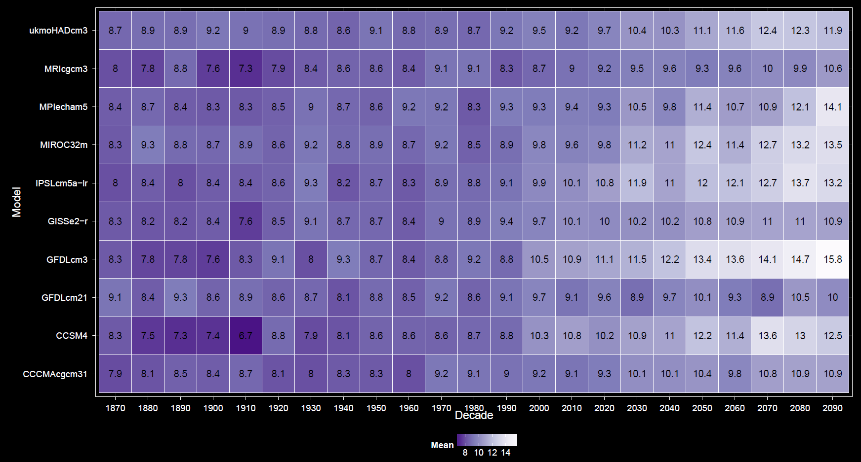
X & Y axes
Though univariate in the the above sense, two categorical variables must still be selected for the axes.
Grouping
Coloring by factor levels does not apply to heat maps. Color refers to the level of the numeric variable.
Faceting
This is similar to faceting for other plots.
Statistics
Each heat map grid cell can show only one value. If there are more factors in the data subset than the two along the X and Y axes, the remainder of the data must be integrated across the levels of these additional factors. This includes averaging across multiple years when year is not an axis variable. Even though year is more clearly numeric, it still behaves as a factor in this context. This is usually be done by taking the mean standard deviation is available as well.
It is worth noting that risk of confusion is more likely here than with other plots. Remember that during data selection, you may choose a statistic regarding your selected variable, e.g., mean temperature or standard deviation in precipitation. These refer specifically to the spatial distribution of the variable, a mean of values across space and a standard deviation of values across space, respectively. Regardless of the choice, the heat map aggregate statistics, mean and standard deviation, refer to summaries of the data across levels of pooled categorical variables (years, months, models, etc.). It is important to pay attention to the meaning of what is being displayed in the plot, such as a mean across factors of a standard deviation across space, or a standard deviation across factors of a spatial mean, and other equally strange sounding combinations like mean of means and standard deviation of standard deviations. If not careful, it is easy to neglect altogether that there are two characteristically different levels of aggregation going on, one across space and one across other variables.
Checkbox Options
Options unique to the heat map include forcing a 1:1 aspect ratio, reversing the color gradient, and displaying values inside cells. The Show CRU 3.2 checkbox integrates CRU into any GCMs already selected. This is not very useful and generally not advisable unless faceting by model in which CRU data appears it its own panel.
Other options are similar to those found in other plots.