Introduction to apputils
apputils.Rmdapputils is an R package containing common utility functions, settings and references for development use across multiple Shiny apps. It is a satellite member of the SNAPverse collection of R packages. It supports other satellites in the verse, including maputils and snaputils.
Package context
apputils has a shinydashboard focus. This is to say that apputils assumes a dashboard layout for your app. While most widgets in apputils will work fine with any app layout and you do not actually have to use a dashboard layout, a few widgets are specific to shinydashboard.
For example, some utilities such as value boxes and info boxes are only available in shinydashboard. Their override functions in apputils will not work if your app does not explicitly use a dashboard layout. However, apputils allows you to force their availability even when not using shinydashboard for your app. See below.
Using apputils
The first and most important step is to call use_apputils in the UI code of your app. This adds the required package CSS. It also adds the resource path that is used by functions like statIcon (see below). Optionally, if you plan on also using rintrojs or shinytoastr in your app, you can set these to TRUE in the call to use_apputils so that you do not have to separately invoke intorjsUI or useToastr.
Regarding availability of value and info boxes for non-dashboard Shiny app layouts, all that is missing is some CSS. For example, if you use apputils::valueBox in an app that has a simple fluidPage layout, you can see that the functionality is there but the widget does not display properly. An easy way around this issue is to add the AdminLTE CSS from shinydashboard. This can be done as follows.
use_apputils(force_AdminLTE = TRUE)This will add the AdminLTE.css styles to your app prior to adding the apputils styles. Note that this is not all the styling from shinydshboard, nor does it attach the shinydashboard package if it is not already attached in your R session. It merely adds this one CSS file containing the relevant styles for value and info boxes. This also means that even if you are not using a dashboard layout, you are still including all shinydashboard styles in AdminLTE.css; it’s is not strictly CSS pertaining to these two specific widgets. Nevertheless, this is a convenient way to access some styles that are usually only available with a dashboard layout.
Custom image icons for value boxes
Here it becomes more clear why it is that apputils overrides valueBox and infoBox from shinydashboard. The apputils versions support the use of custom icons based on image thumbnails, which opens up limitless possibilities for users to display any icon they want. You are no longer restricted to the generally milquetoast selection of the usual online icon libraries. The quickest way to see all available custom icons currently in apputils is to launch the icons demo app. Since this is R/Shiny, they all have an analytics theme.
library(apputils)
exApp("icons")
Use exApp("icons", local_mode = "showcase") to run the app in Shiny showcase mode for additional information.
When leveraging these icons in your own apps, the statIcon helper function makes accessing the png resource files in apputils easier.
statIcon("mean")
#> [1] "resources/images/stat_icon_normal_mean_white.png"
statIcon("mean", "black")
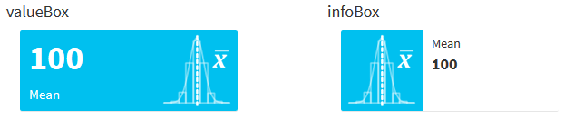
#> [1] "resources/images/stat_icon_normal_mean_black.png"Generating a value box is as easy as the following. Note the key difference is in how icon is called. In addition to valueBox and infoBox from the shinydashboard package being overridden by apputils, so is icon from the shiny package. With apputils::icon, the name argument can be a list with a src entry, e.g., name = list(src = statIcon("mean")). This is combined with passing lib = "local". As mentioned, info boxes are also available with custom image file icons. Here is a quick comparison.
ic <- icon(list(src = statIcon("mean"), width = "80px"), lib = "local")
valueBox(100, "Mean", icon = ic)
infoBox("Mean", 100, icon = ic)
There are a number of other features in apputils. Additional sections will be added to this vignette later.