Levels of measurement
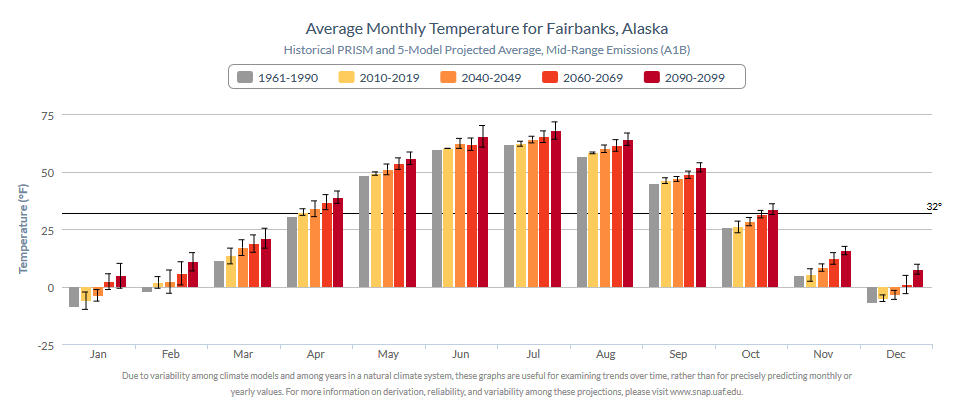
To get started, an example version 1 Community Charts graphic is shown below to illustrate a key opportunity for improvement. The original plots are available in Celsius (C) or Fahrenheit (F) degree units. Although bar charts or column charts whose bars originate from a fixed baseline make sense for random variables with a real zero, e.g., precipitation amounts, they are problematic for a random variable such as temperature. Unless using the Kelvin scale, which we are not, temperature data in C or F is restricted as interval type data in terms of level of measurement, whereas precipitation data permit both interval level and ratio level measurement.
Compared to a line plot or scatter plot which are more sensible, plotting temperature using bars leads to a natural inclination to view temperature as an amount, to see it as ratio data, despite using using measurement scales and ranges of data where this does not make sense. In looking at the graph this may not be a conscious thought, but relative to an arbitrary baseline, differences in temperature may be seen as greater than they really are for bars of substantially different height and lesser than actual for bars of similar height.
Another thing to note is that with the inclusion of error bars, the odd interpretation of primary bar height becomes even more evident and possibly confusing. Sometimes the confusion is even misplaced: “Why is the error so much greater around this bar than that bar?” The real issue is simply that error bars may seem bigger relative to a shrinking primary bar based on proximity to the arbitrary baseline value. The error bars remain insensitive to this shrinkage and expansion based on distance from the arbitrary baseline because they are, like precipitation, ratio level data. As with precipitation levels, one can make a simple statement like “There is twice as much error around this value than around that value.” We do not say there is twice as much temperature when one temperature bar is twice the height of another.
Version 1 Community Chart
Bar baseline
If there is specific interest in degrees above or below freezing for instance, then the baseline is not arbitrary, nor is bar height problematic. This is because in framing the measurement in this way, we have technically just defined a new random variable. It is an amount, with a real zero, and now represents ratio type data. This is true as seen from either direction. Even for negative values below the threshold, the negative sign represents direction while the positive value is a distance. Ultimately, this is rarely how the Community Charts application is viewed. There is more interest in general temperature trends over time, in a manner that genuinely reflects interval level measurement.
The most flagrant issue with the above plot is that the bars maintain a baseline of zero degrees regardless of the unit of measurement! This was known at the time, evidenced by the forced inclusion of a 32 degree F line for reference to a baseline that is not being used and that is not intrinsically interesting anyhow. Thankfully, this 32-degree line is not similarly hardcoded into the Celcius version just as the use of a 0-degree bar baseline is hardcoded here.
As long as a bar plot is used to display these trends, there will have to be a baseline. Later this problem will be circumvented with an alternative type of bar plot, but for now we continue with a common baseline value. We will stick with freezing/melting point as one sensible baseline.
As a quick aside, another option is to use the historical “baseline” average temperature, as it’s ironically already called, as a bar baseline. This may be more sensible given the general utility of the information in the graph. Additionally, there would then be no need to plot twelve monthly historical period bars, greatly freeing up space and opening up the plot in a way that could make it more easily readable. This approach does present some difficulties as well.
Below are two example plots from the Community Charts version 4 Lite suite using each temperature scale. The baseline is adaptive, defined as the freezing point irrespective of units of measurement. When changing the measurement scale, the data are not transformed in any way that should change the appearance of the bars in the two plots. Only the y-axis need take on new values. The two plots appear almost the same, and nothing like the original example shown above.
Freezing point baseline: Celsius
Freezing point baseline: Fahrenheit
Error bars
Another difference that stands out is the increased range of the error bars. In neither version of Community Charts are these “error bars” in any strict sense. In the first version, the bars are so small because they represent one standard deviation, as computed on a set of only five values (the five climate models). Standard deviation naturally invokes a notion of symmetry. In fact, as can be expected, the bars in the original plot are drawn extending symmetrically one standard deviation from the mean in each direction. This is based on a small collection of future values from a highly uncertain variable and there is no way to see from the plot how these five climate model values are distributed around their mean.
Considering the small sample, the possible skewness of the values, that variability is not the same as uncertainty, and that the models and scenarios available in the Community Charts application account for only a portion of the total uncertainty in future projections, it is arguably more useful as well as honest to display the range of the five climate models than the standard deviation around the mean. In any case, it is easy enough to optionally provide either statistic for error bars. Version 1 allows error bars to be toggled on or off. Below are version 4 plots showing each of three options when plotting precipitation trends.
[Side note: Although the standard deviation is smaller than the range, it is also clear that the standard deviation bars in the original version are substantially narrower than even the standard deviation bars in the new version. As with the temperature and precipitation values, the standard deviation error bars should not be exactly the same in both versions because the new version uses updated data and different climate models. Nevertheless, the error bars in the original Community Charts application appear to be about half the width of corresponding standard deviation-based error bars in version 4. One must wonder if instead of showing a line extending one standard deviation from the mean in each direction, a line one standard deviation in total length was centered on the mean. ]
No error bars
Error bars: +/- one standard deviation from the mean
Precipitation is a random variable that typically displays natural heteroskedasticity. Error bars may be larger, requiring a greater range for the overall y-axis in the graph, hence why the colored bars appear smaller now.
Error bars: range of the five discrete climate models
Precipitation is also likely to have a skewed distribution. This can make it difficult to accurately depict variation when using the standard deviation without any additional information. Here the full spread of the five individual models is depicted by the error bars.