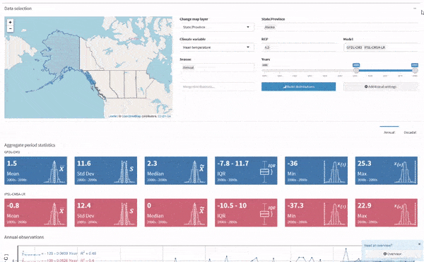
Climate analysis
Projected spatial distributions
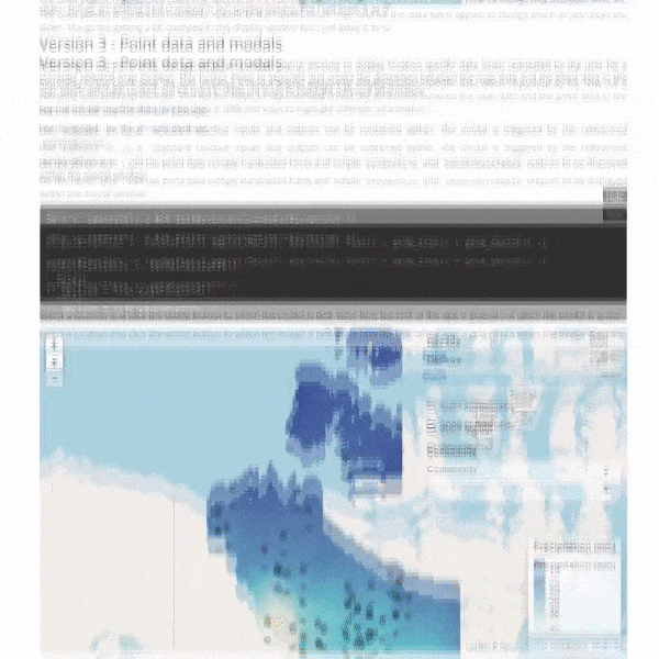
One of my favorite things to do with R is create apps using Shiny that showcase whatever I just used R to accomplish. It's one of the best ways for sharing and communicating not only the results of statistical analysis but also the analysis itself. It allows others to become an active participant in the analytical workflow, reproducing parts of the process in their browser interactively, even if they don't have a quantitative background or know any programming. Here are a few example apps:
Projected spatial distributions
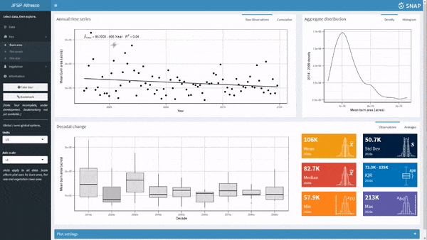
Alaska wildfire model outputs
Embedded aplications
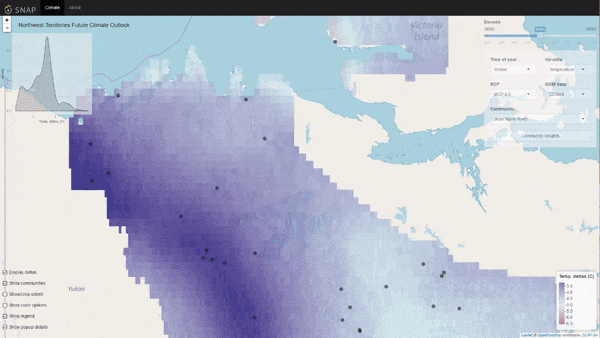
Projected spatial climate maps
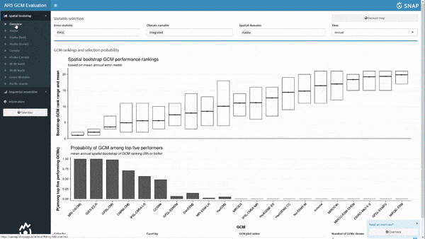
CMIP5 GCM model selection
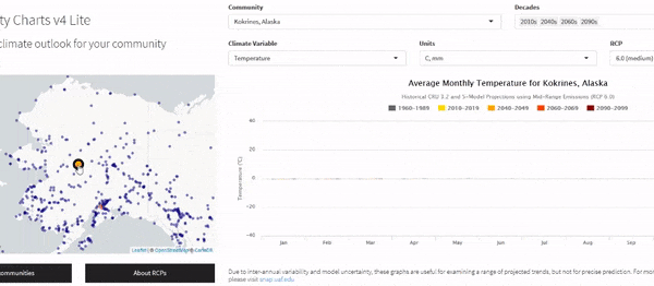
Community-level climate projections
Here are some R packages I've made for a broad range of purposes.
epubr: A package for reading EPUB files. epubr reads and parses metadata and text content of EPUB files into a tidy data frame for text analysis.tiler: A package for creating map tiles. tiler creates map tiles for use with packages like leaflet. Tiles can be geographic or non-geographic (simple coordinate reference system).rtrek: A package for all things Star Trek. Use rtrek to access and analyze Star Trek universe datasets.trekfont: A fun add-on data package containing 107 Star Trek fonts.rockchain: A package for blockchain integration. rockchain interfaces with select APIs for accessing Bitcoin wallet data and general cryptocurrency market cap data.memery: A fun package for combining statistical graphs with attention-grabbing memes. It supports static memes and animated gifs. Perfect for data nerds.tabr: A package for programmatic authoring of guitar tablature in R. tabr connects to the open source LilyPond sheet music engraving program to produce high quality tabs and sheet music.rvtable: A package to assist with chaining big data through multiple stages of an analysis with minimal overhead by modeling empirically estimated probability density functions to robustly reduce large samples with minimal, controlled information loss. rvtable stores continuous densities in tidy tibble data frames.mapmate: A package to assist with simple globe animations. This package is primarily an encapsulation of small, reproducible educational examples based on an approach I've used in the past for globe animations. It is not meant for heavy, generalized production.
Read EPUB files

Create map tiles

All things Star Trek

Star Trek fonts

Blockchain integration
Graphs and memes
Guitar tablature with R
Continuous pdf tables
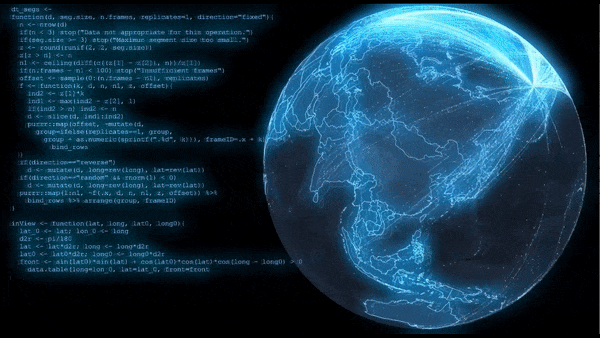
3D globe map animations

SNAPverse R package ecosystem
I enjoy producing data visualizations ranging from simple graphs to complex animations and videos. Data and the results of data analysis should be presented in clear, simple forms. This usually means static graphics with minimal ink, little or no color, among handful of other graphing best practices. But there are also times when it is important to grab an audience's attention. Here are some example animations I've created based on spatio-temporal datasets.
SNAP Shiny Apps global user traffic
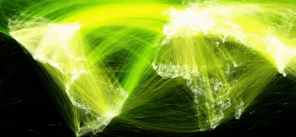
High density great circle arcs

Rasterized grid cell pathways
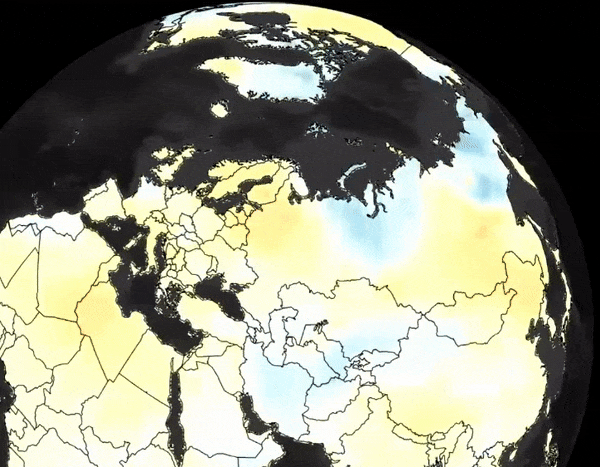
Spatially explicit projected global temperature anomalies
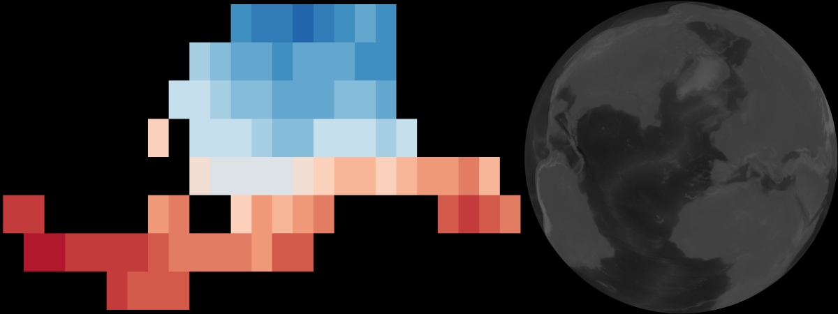
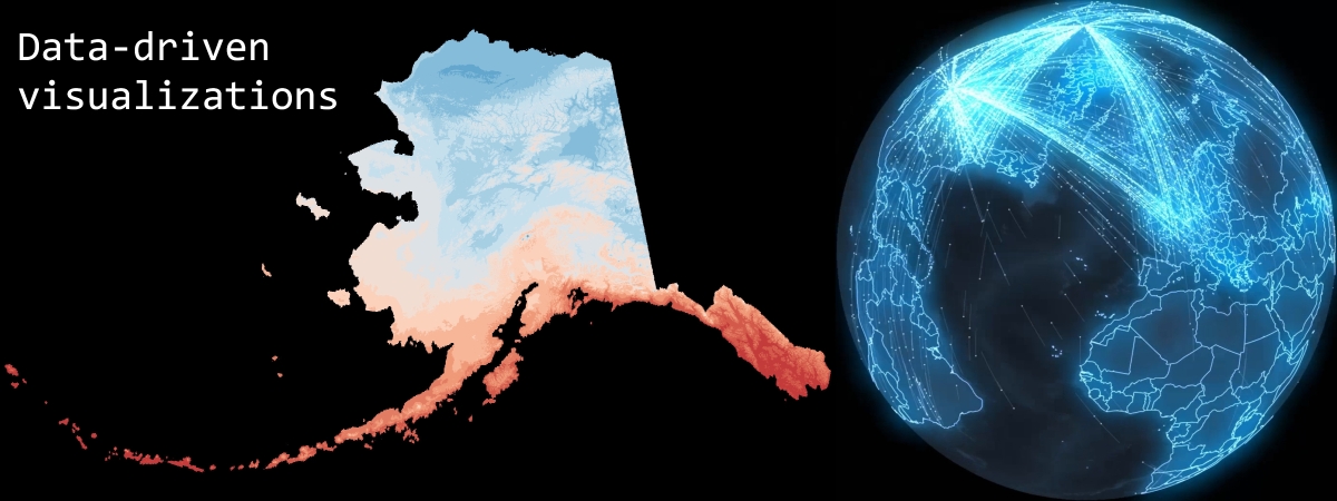
All visualizations are data-driven and flow from upstream, programmatic statistical analysis and mathematical computation. The before and after slider panel below highlights two examples.
Drag the centered slider up and down to see the before and after. If it's not working try refreshing the page.